Introduction
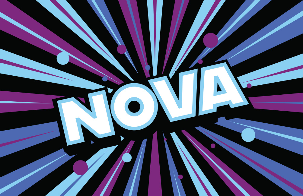
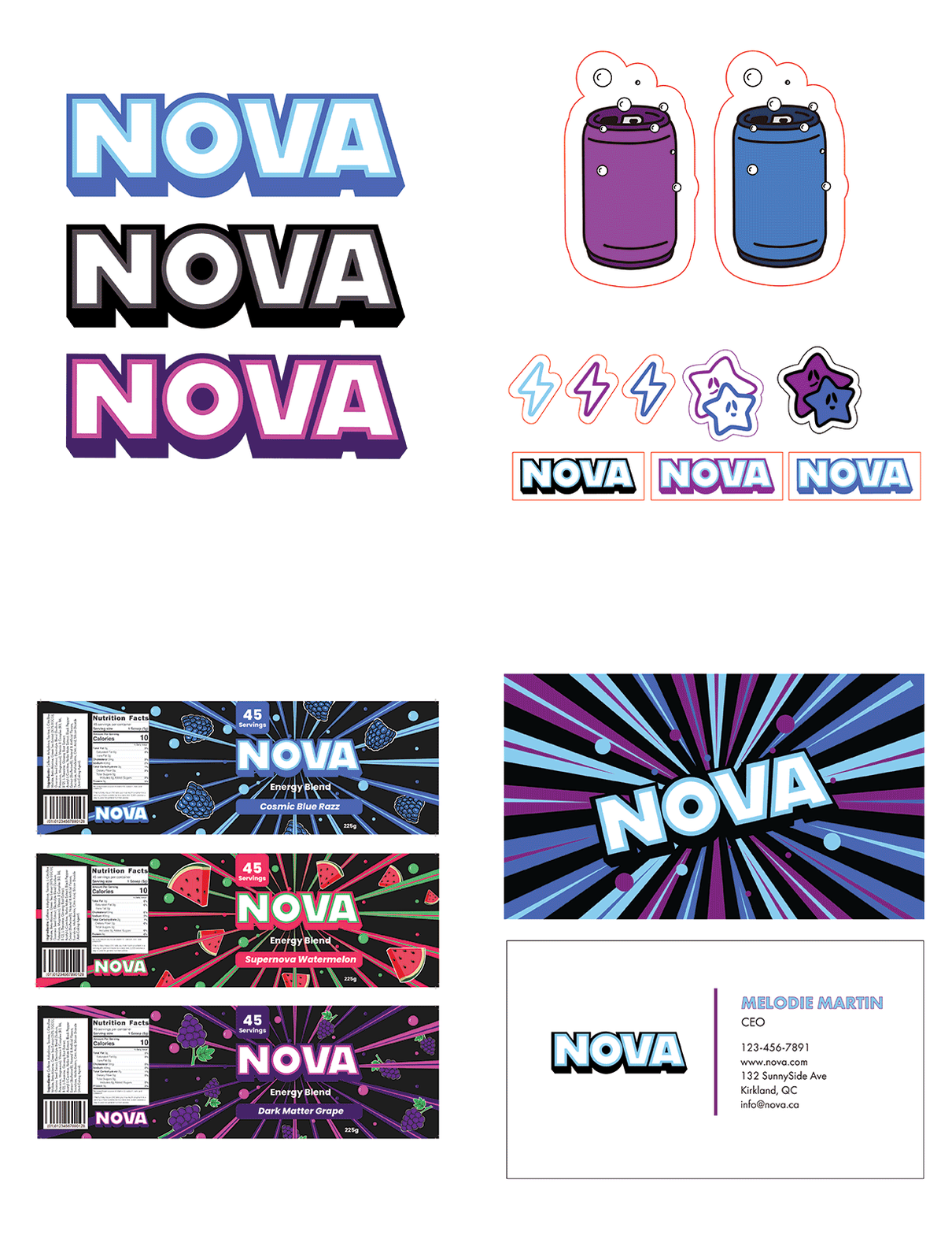
For our Branding class, we were assigned to create an original brand concept and design its complete identity. My teammates Olivier Huber, Preston Mrowczynski and I decided to create an energy drink brand called NOVA. The concept behind NOVA was to capture the idea of limitless energy, confidence, and motion. Inspired by the supernova, this drink brand is composed of bright and eye-catching colours such as purple, various blues with contrasting colours such as white and black.
We noticed that most brands had very heavy, aggressive and dark visuals. We wanted NOVA to look more colourful, refined and cosmic. We created stickers that implied that our theme revolved around bursts of energy and the galaxy. And so we made stars and lightning bolt stickers to showcase that.
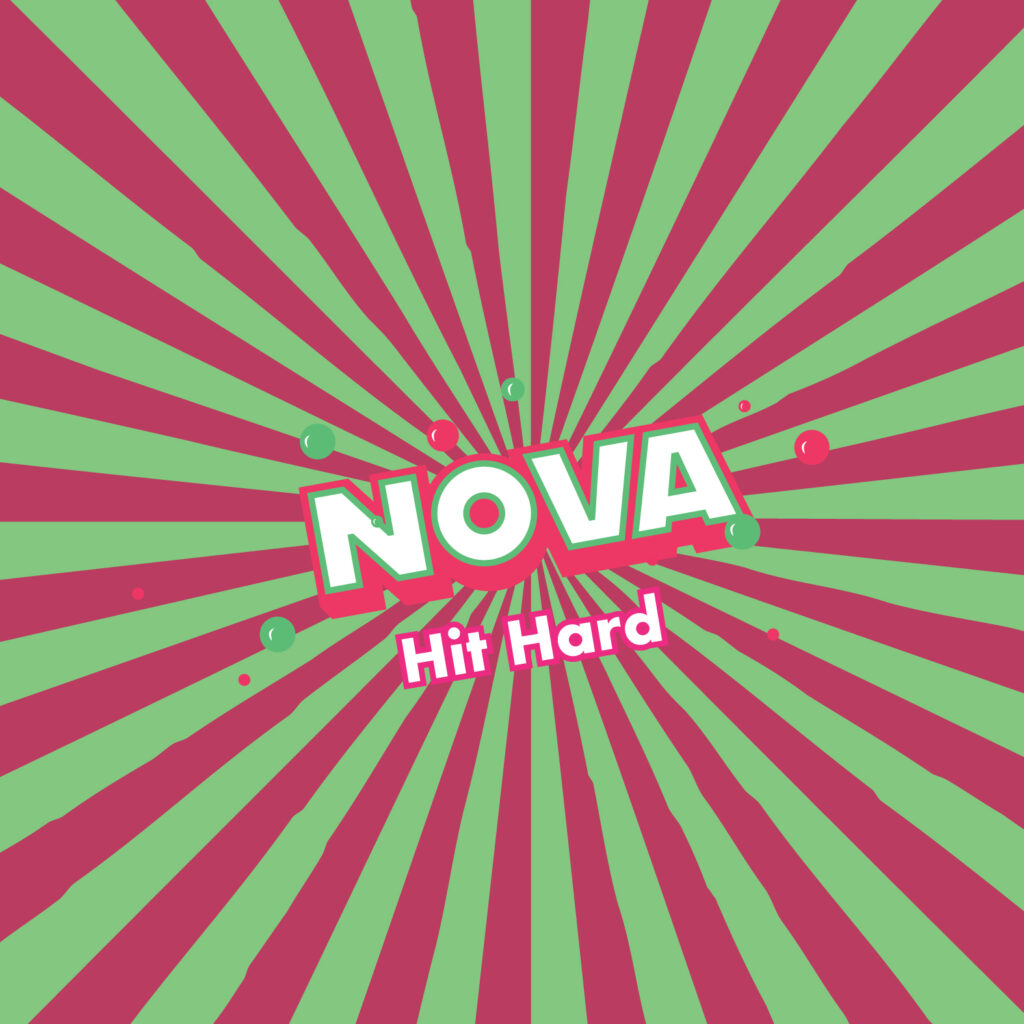
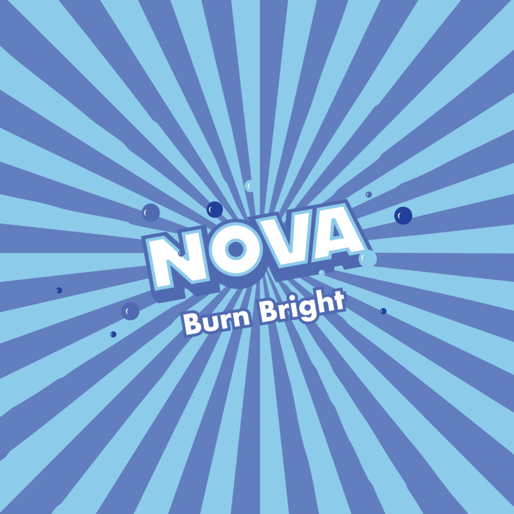
Colour & Typography
For typography, we explored many different typefaces, uppercase and lowercase and finally we we chose bold and modern typefaces to represent the energy of our brand. The stronger letterform helps communicate confidence and energy, while also keeping the design readable and impactful across packaging, ads and digital media.
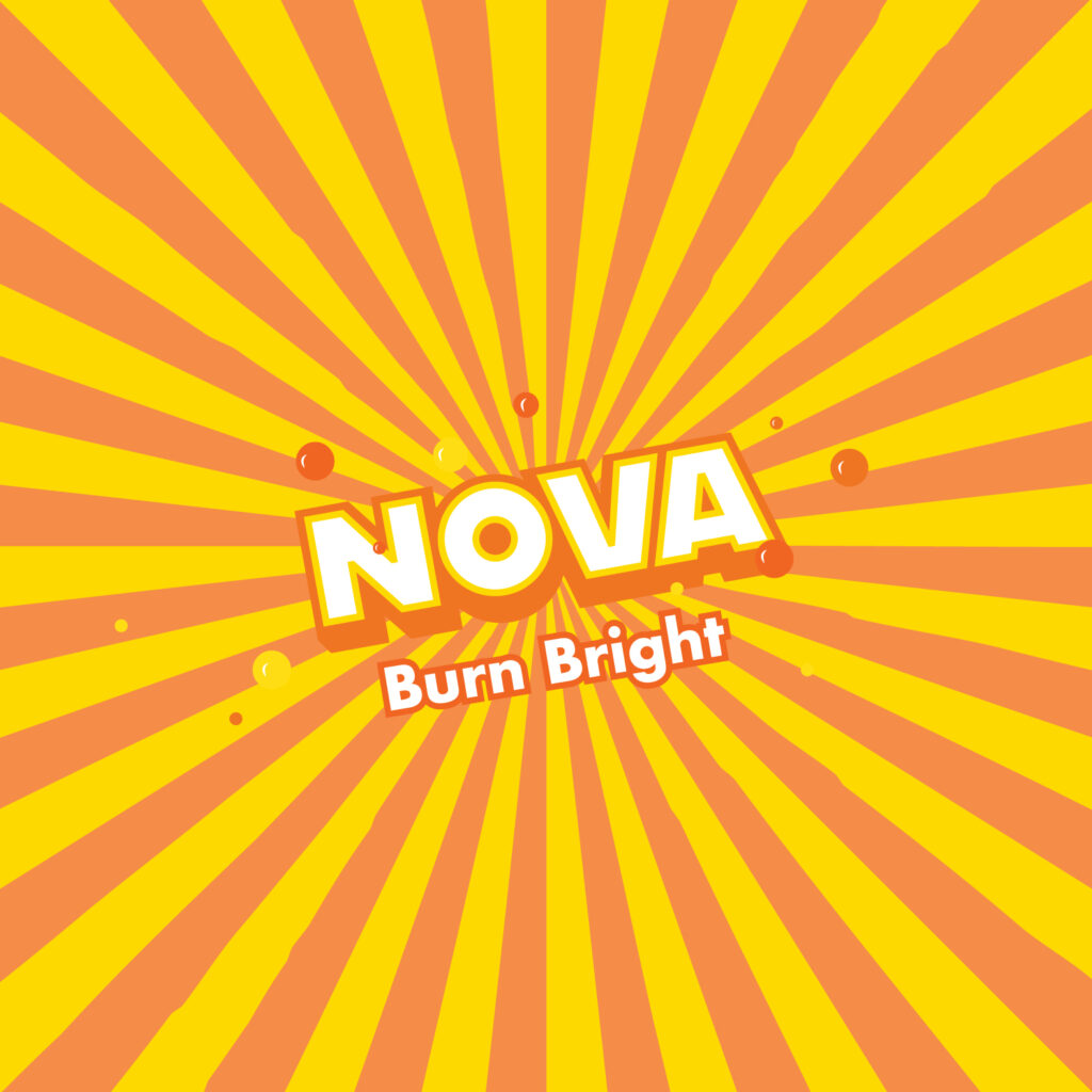
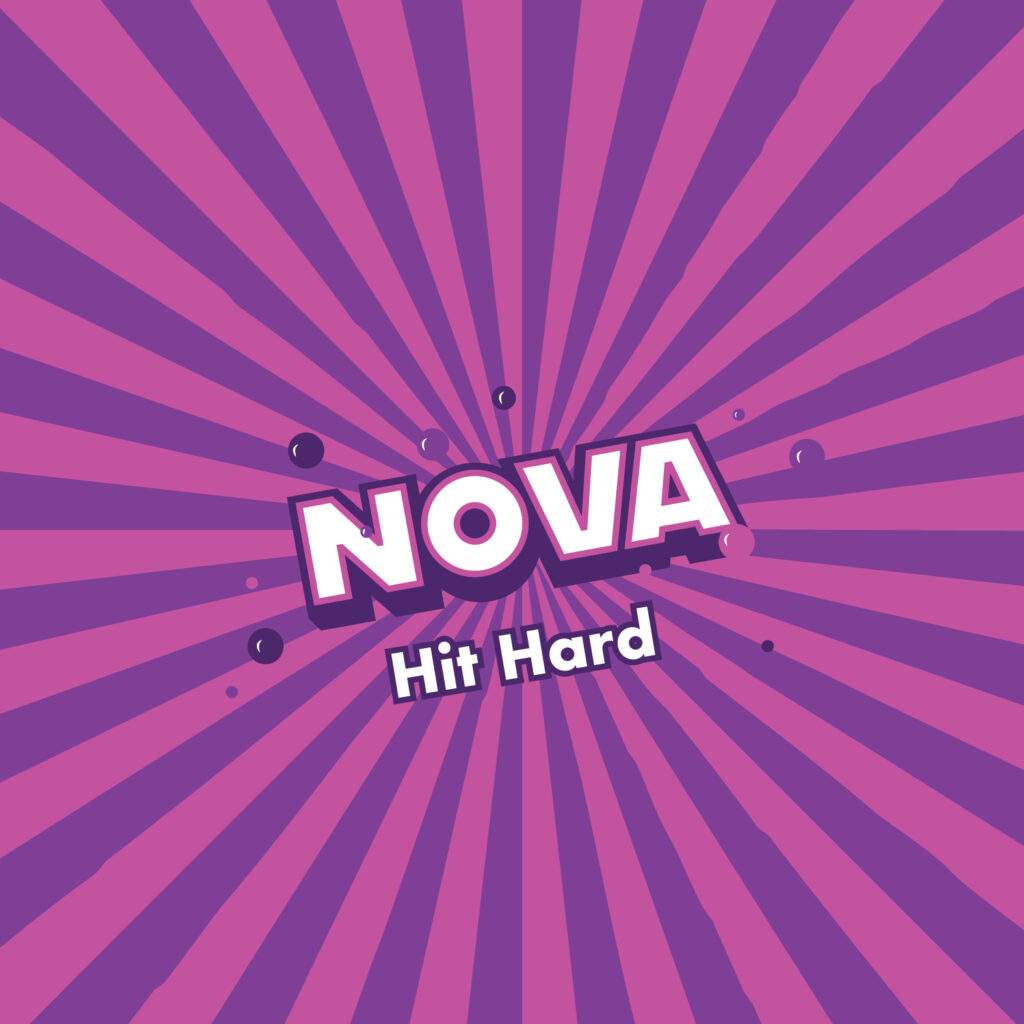
The colour palette we chose (Purple, Blues) was chosen to represent the colourful energy of space and electricity. Both colours are eyecatching. They symbolize the burst of energy this drink will give you. White and black were chosen to make the colours contrasting. It balances the design, giving it a clean modern contrast. All together, these colours and shades reflect the brightness and darkness of space, and also reflect the feelings you have while consuming our product.
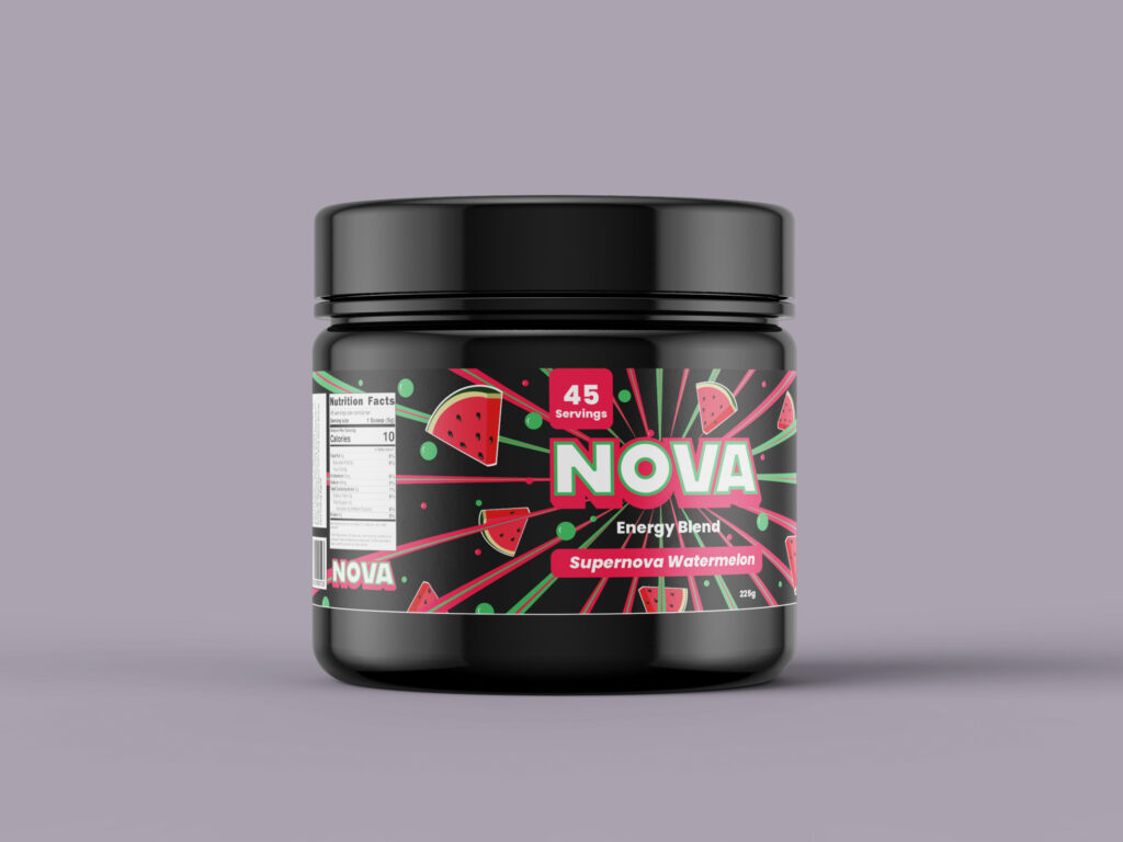
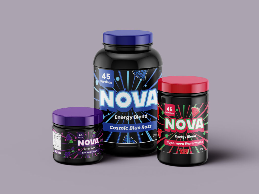
Finally, the logo and packaging design combine all these elements. We decided to keep the logo plain and simple but also bold and powerful, making it impossible to skip if you’re looking in a vending machine. The business cards have sharp, colourful motion lines to replicate the feeling of superspeed, almost like flying through space. The result is a cohesive brand identity that feels futuristic, dynamic, and full of life, just like the energy burst of a supernova.
Team members Portfolios
