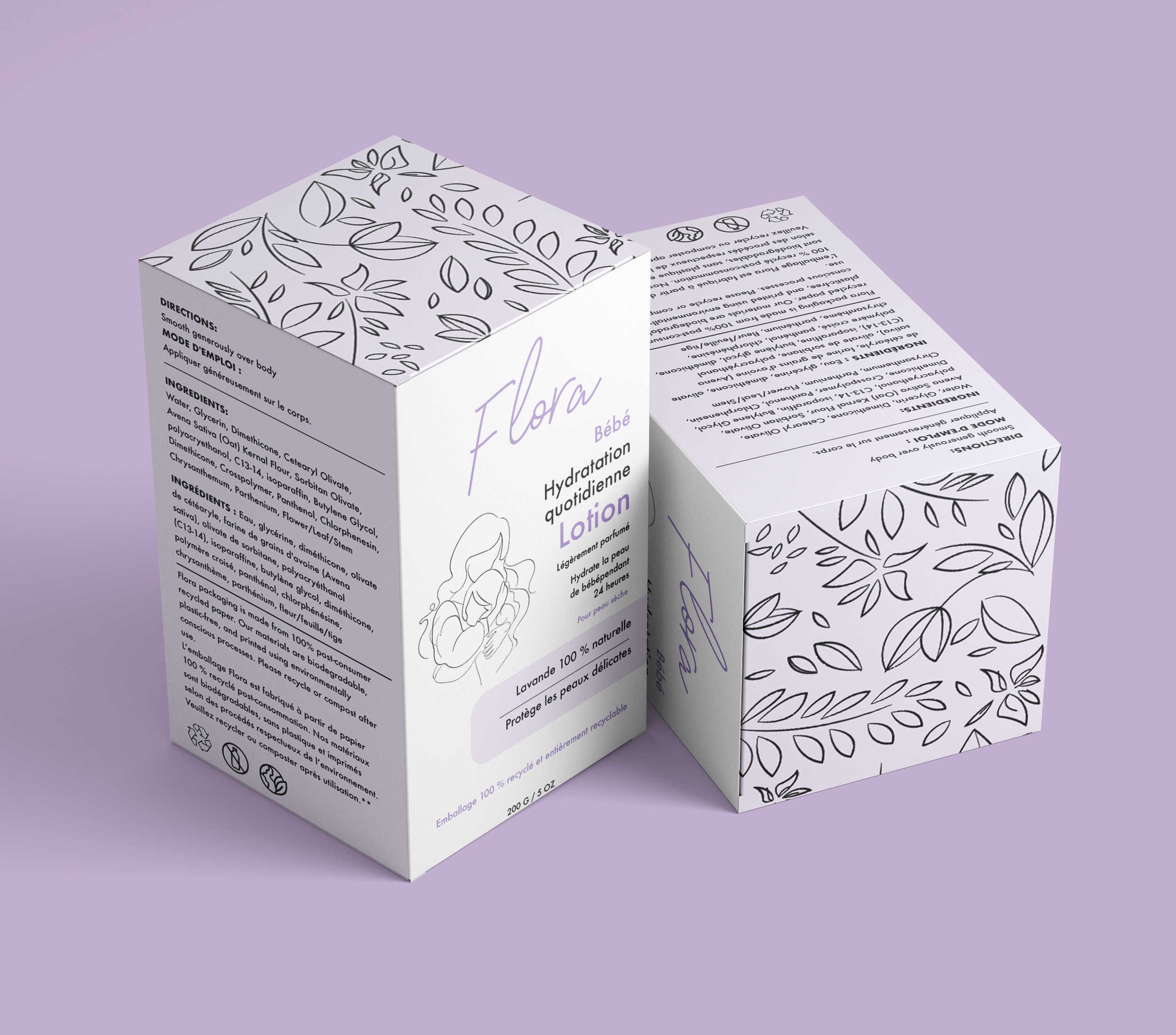
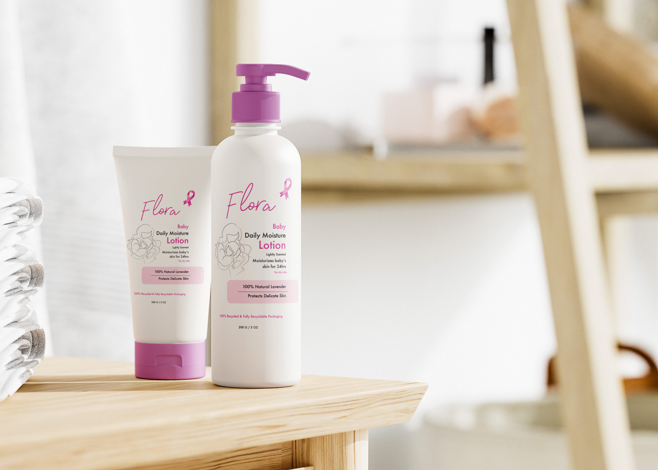
I focused on keeping the layout clean and easy to read, especially for the directions and ingredients, since parents look for clarity and trust in baby products. I also chose to highlight natural lavender and skin-safe qualities to reinforce the idea of comfort and care. The icons and bilingual text help make the packaging feel more complete and professional.
One of the goals was to make the box look modern while still being minimal and approachable. Overall, this project helped me practice hierarchy, branding, illustration, and package layout, and I’m happy with how cohesive and gentle the final design feels.