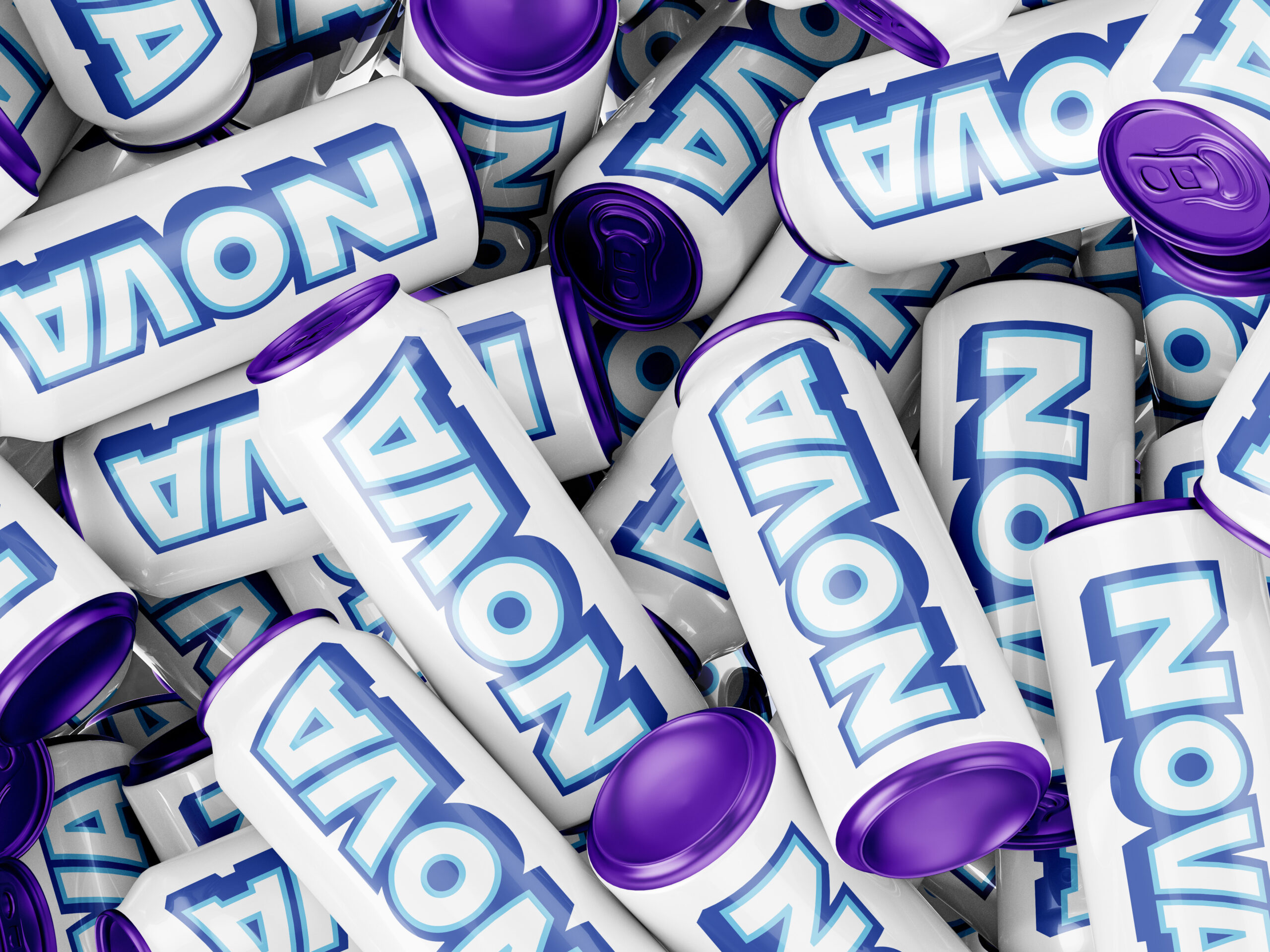
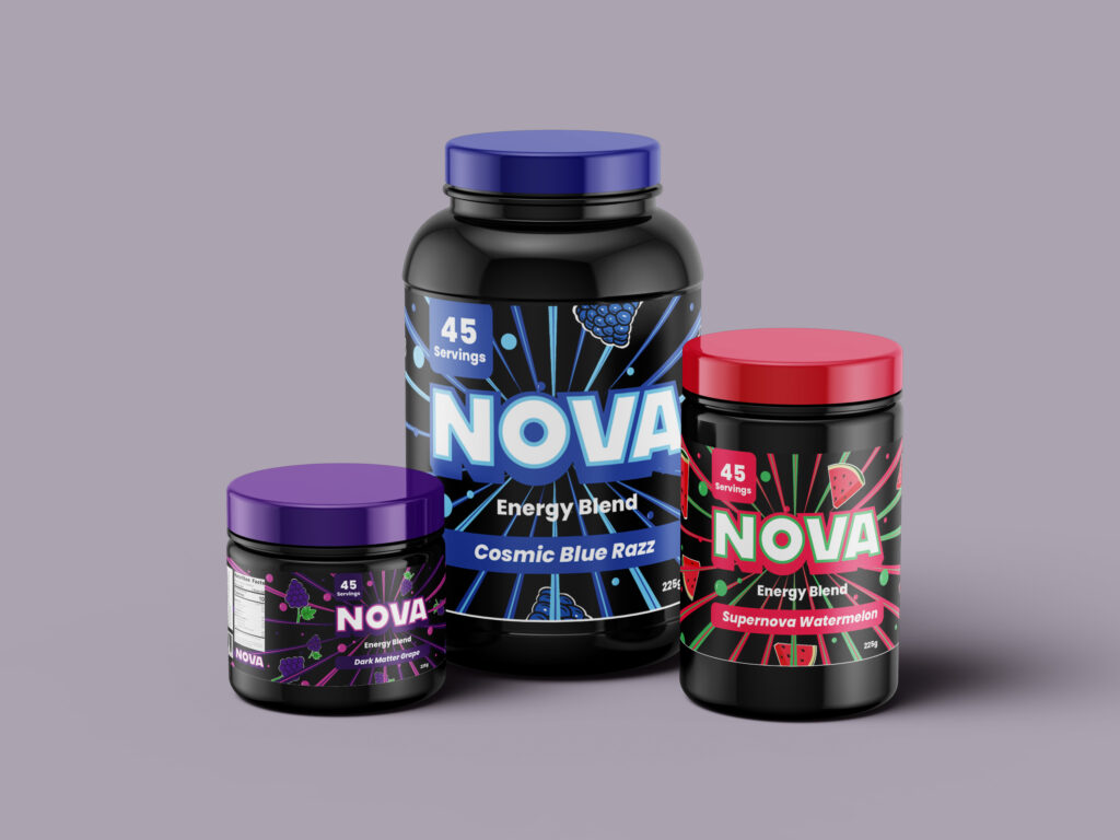
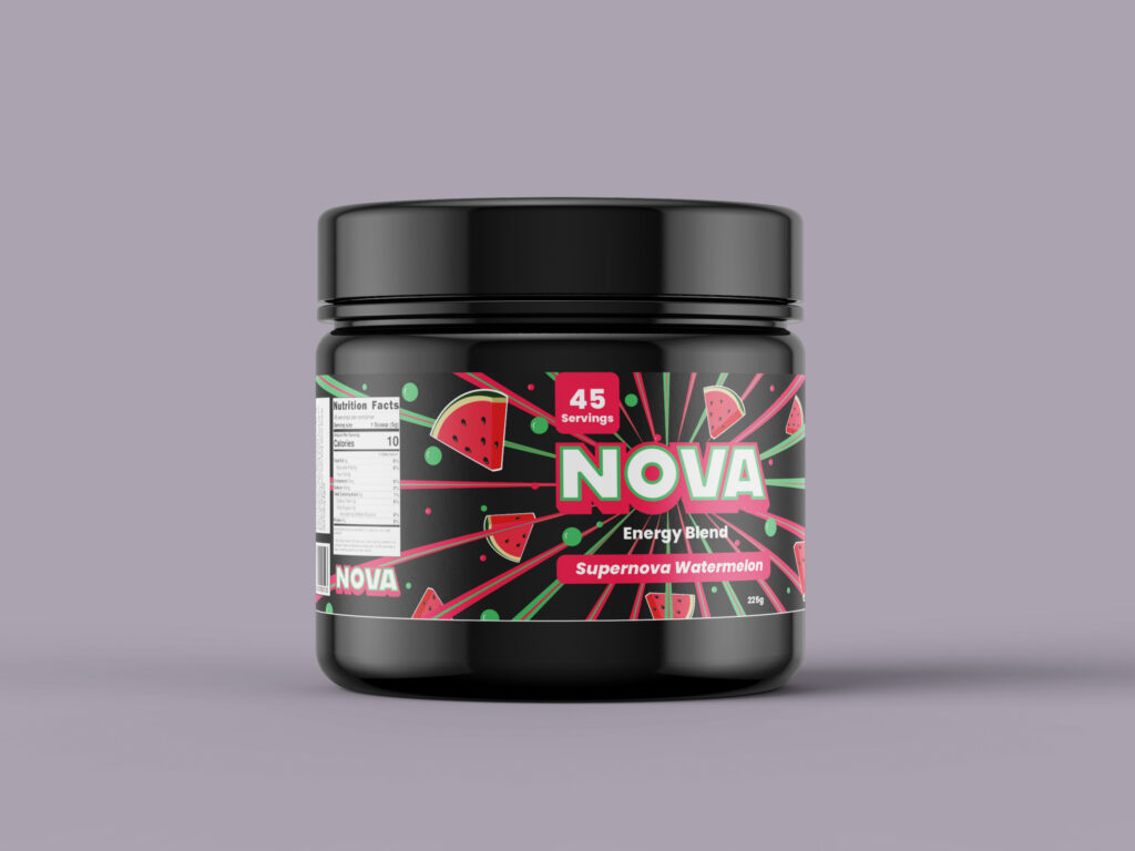
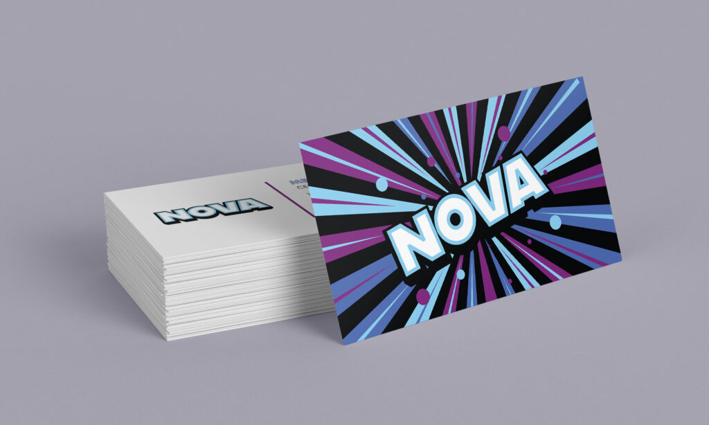
We noticed that most brands had very heavy, aggressive and dark visuals. We wanted NOVA to look more colourful, refined and cosmic. We created stickers that implied that our theme revolved around bursts of energy and the galaxy. And so we made stars and lightning bolt stickers to showcase that.
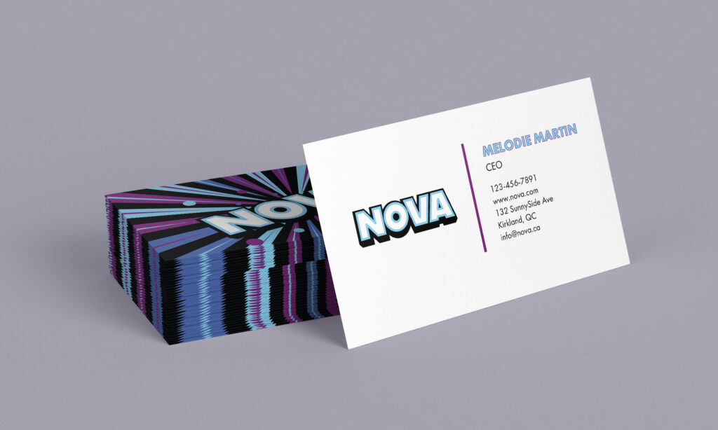
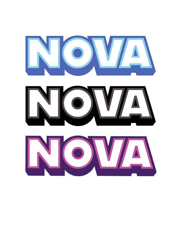
The colour palette we chose (Purple, Blues) was chosen to represent the colourful energy of space and electricity. Both colours are eyecatching. They symbolize the burst of energy this drink will give you. White and black were chosen to make the colours contrasting. It balances the design, giving it a clean modern contrast. All together, these colours and shades reflect the brightness and darkness of space, and also reflect the feelings you have while consuming our product.