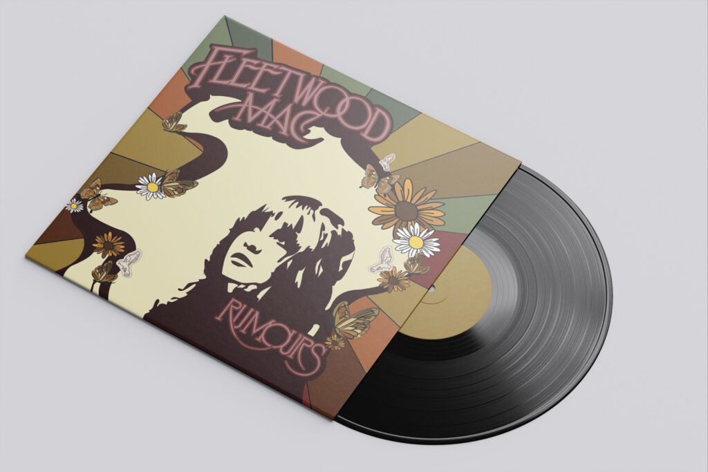
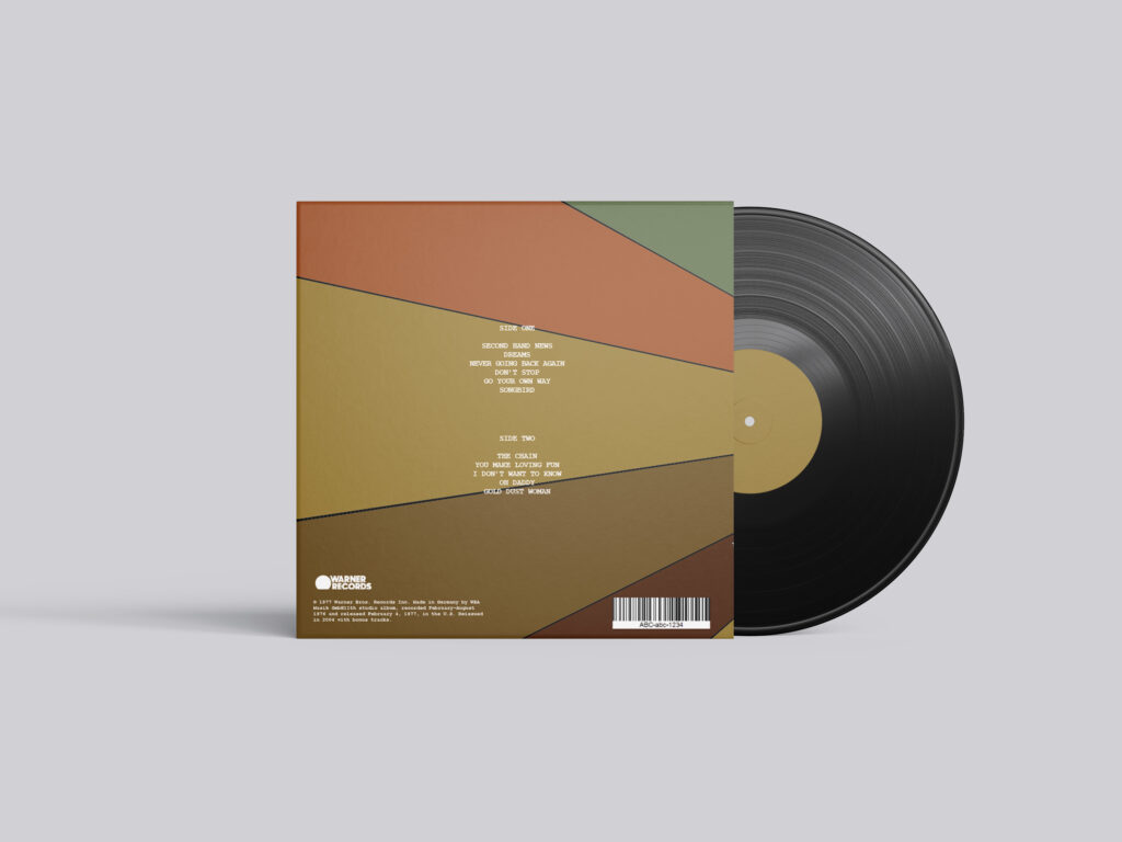
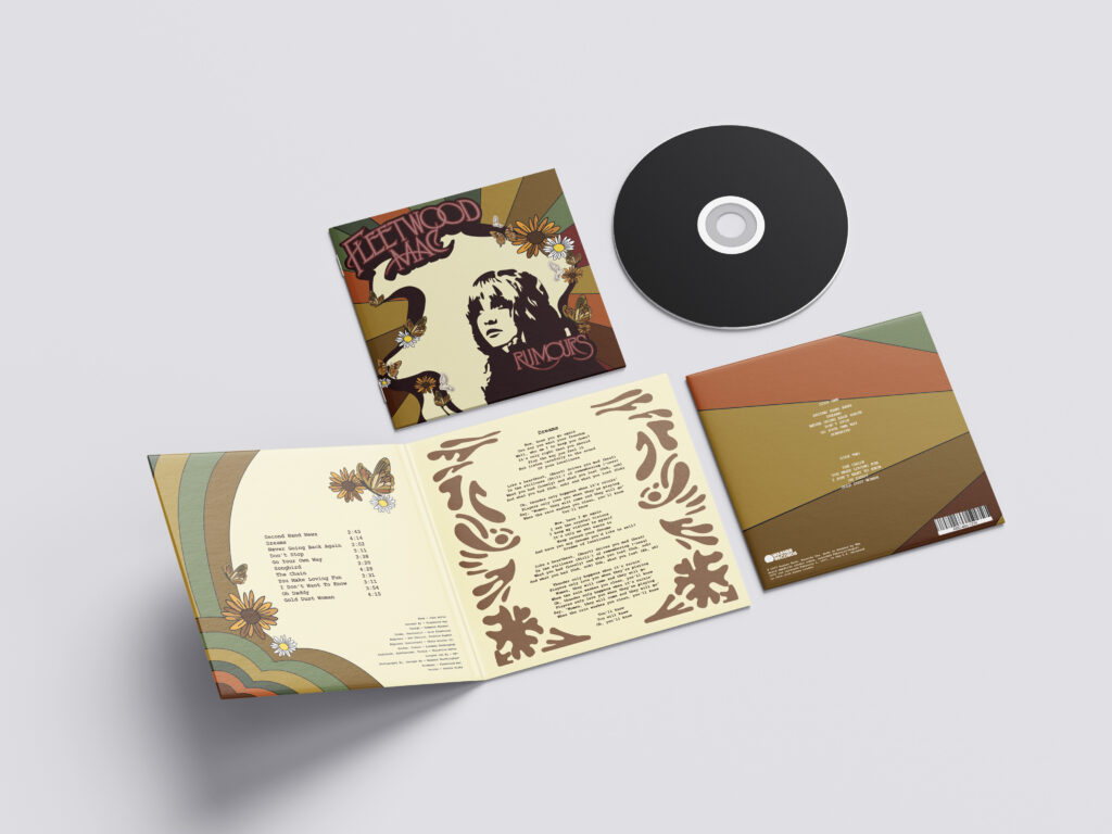
I used a vintage colour palette with earthy greens, warm oranges, browns, yellows, and deep reds because those colours remind me of the 70s and match the nostalgic mood of the music. I added butterflies, flowers, and flowing shapes to give it a bohemian and dreamy style, especially to reflect Stevie Nicks’ aesthetic. The portrait and bold typography help make the design feel expressive and stand out, while the layout creates movement like the rhythm of the songs.
Overall, my goal was to make a redesign of this vinyl that represents the way I feel when I listen to it.