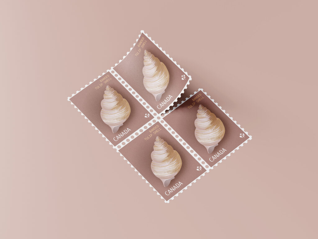
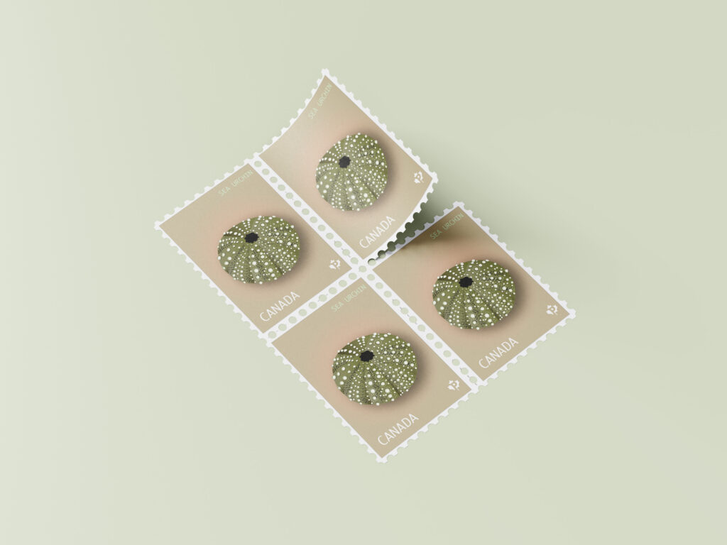
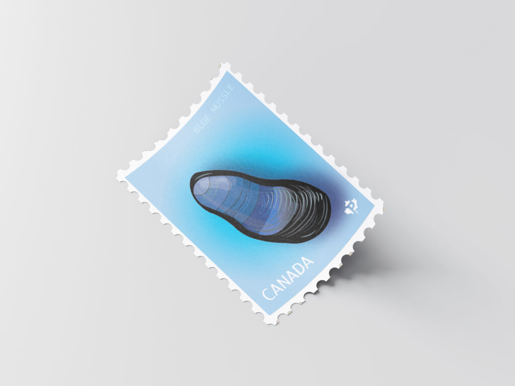
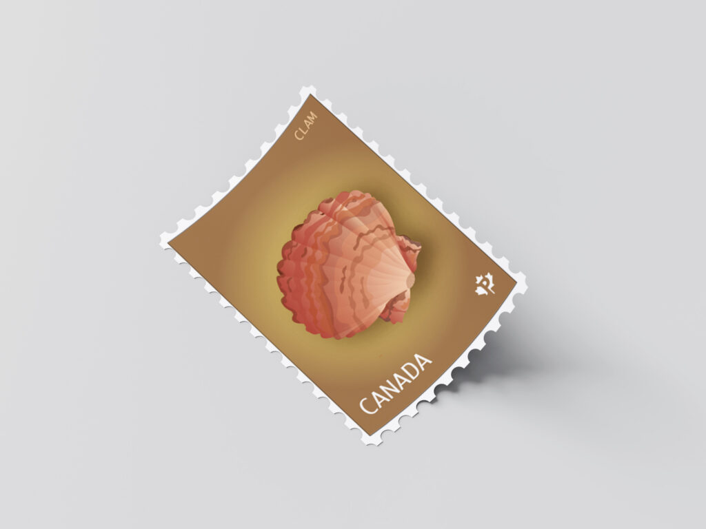
For this illustration project, I created a series of postage stamps featuring different sea shells: a banded tulip shell, a mussel, a sea urchin, and a clam. I chose these because each shell has its own shape and texture, which let me experiment with different line work and shading. I also really enjoyed this theme because I love shells and beaches, and it felt personal to me since I’m from a coastal town. Working with subjects that remind me of home made the project more meaningful and enjoyable.
I used a soft, muted colour palette with sandy neutrals and pink-brown tones so the stamps would look calm, elegant, and cohesive as a collection. The simple backgrounds and minimal typography help the illustrations stand out while still looking like authentic Canadian stamps.
Overall, my goal was to design a stamp series that feels delicate and collectible, while showing consistency across the four illustrations. This project challenged me to work with fine details at a small scale, but it also let me express something that connects to my own memories and surroundings.
